Deprecated: Function get_page_by_title is deprecated since version 6.2.0! Use WP_Query instead. in /var/www/headword.devphase.io/public_html/wp-includes/functions.php on line 5413

Wheelers

Giving a modern facelift to an outdated brand.
Full Service
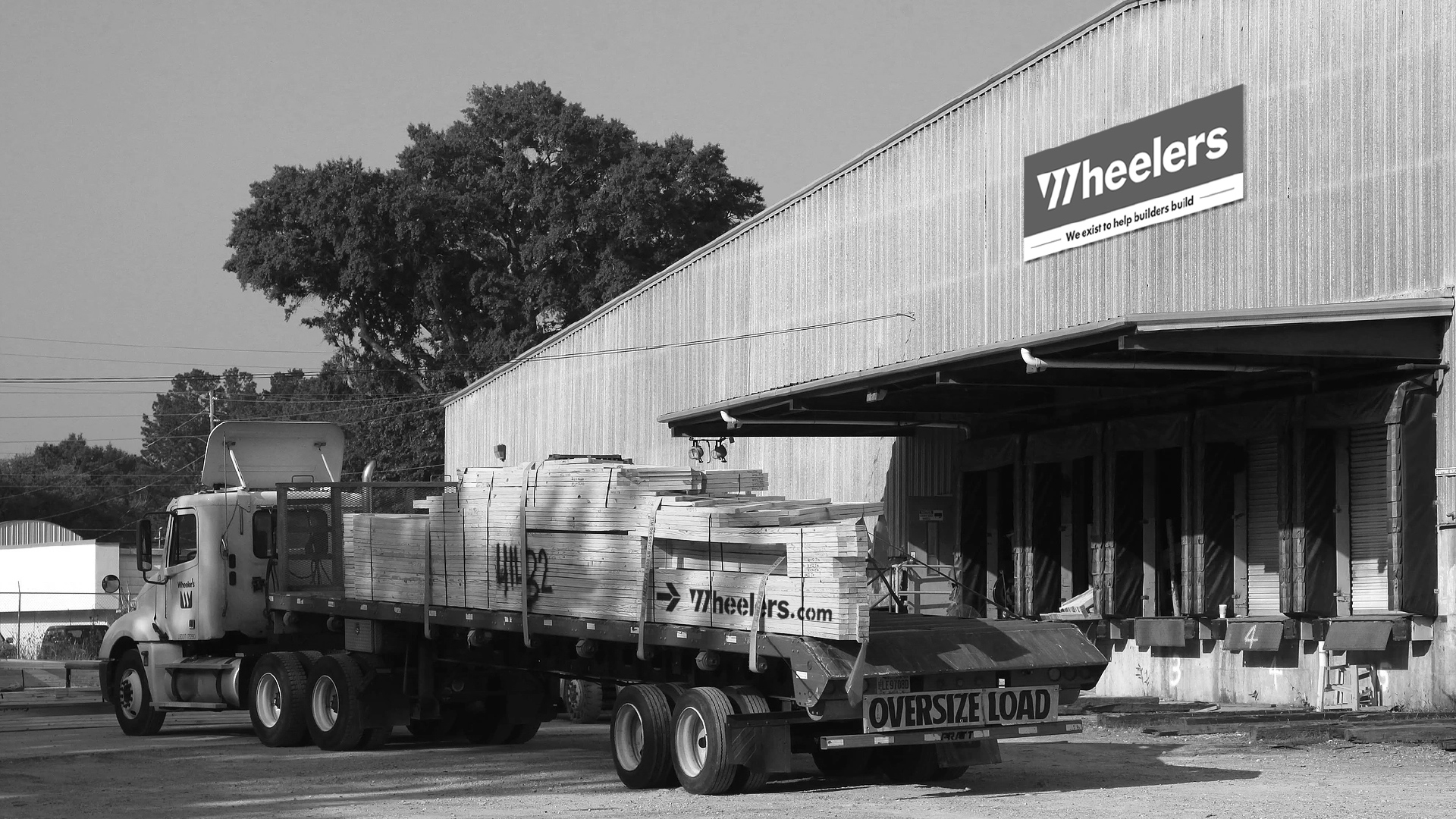
A truck loaded with wood trusses drives away from Wheelers’ manufacturing plant.

Background

Wheelers is a wood truss manufacturer based out of Rome, GA. They started their business in 1949, and has since grown to become one of the largest suppliers of wood trusses on the Southeastern seaboard. But as their business grew, their branding and website became outdated. They needed a modern way to not only keep up with business, but to further expand it. They looked to Headword to offer some top-notch creative help.

Services Provided

  • Brand Activations
  • Brand Identity
  • Campaigns
  • Content Creation
  • Digital Design
  • Experiential
  • Research & Strategy
  • Video & Animation
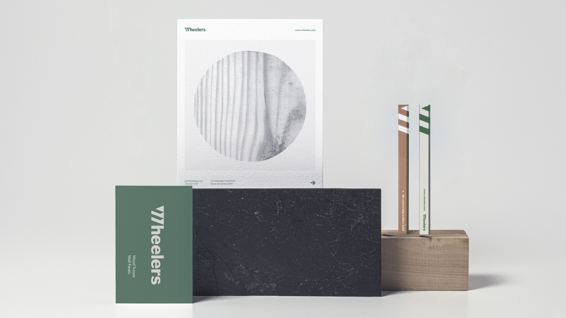
A Wheelers business card sits vertically in front of a slate block. On top of the block is an image of wood grain. Next to it are two branded pencils propped on a wooden block.

Old Logo

The old Wheelers logo had a distinctive sawblade mark. The letters crowded together making it blocky and hard to read.

New Logo

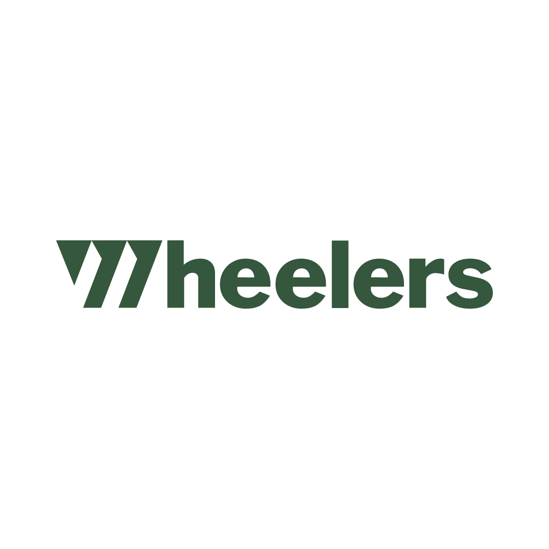
The new logo is easier to read with letters more spaced out and a reverse of their old logo, giving it a more updated look.
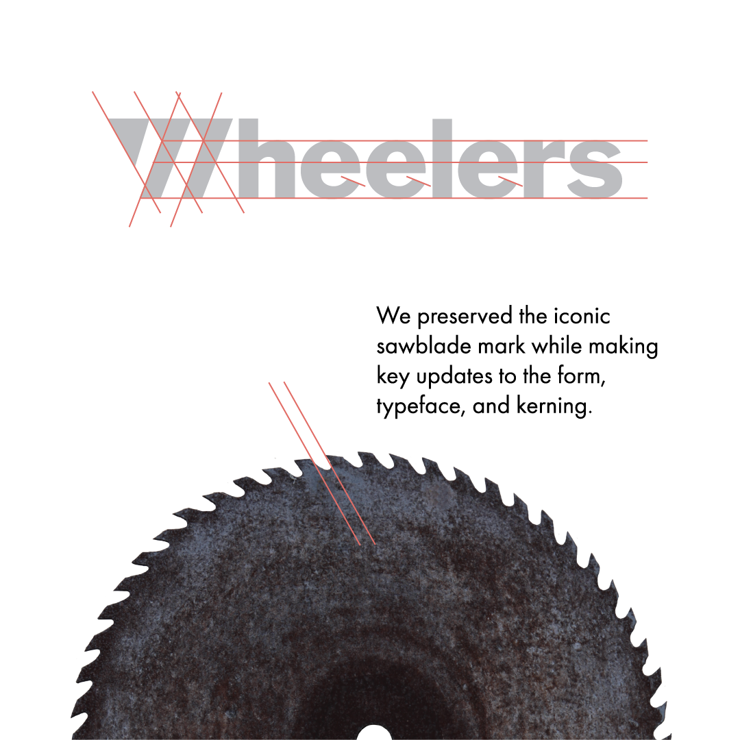
We preserved the iconic sawblade mark while making key updates to the form, typeface, and kerning. Linear guides on a saw blade show the precise angle we mimicked with the new logo.

Approach

It’s easy to feel outdated in a wood manufacturing business. Customers are used to doing things a certain way due to the nature of the business. Often these processes can be a little convoluted and archaic. We knew the key to bring Wheelers up to date would be simplicity. We wanted to modernize without sacrificing essential communication.
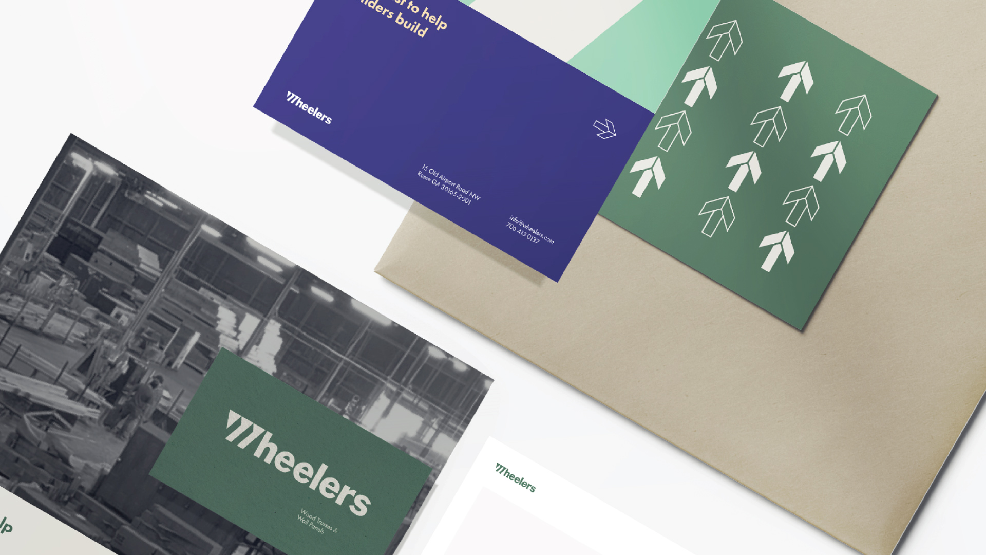
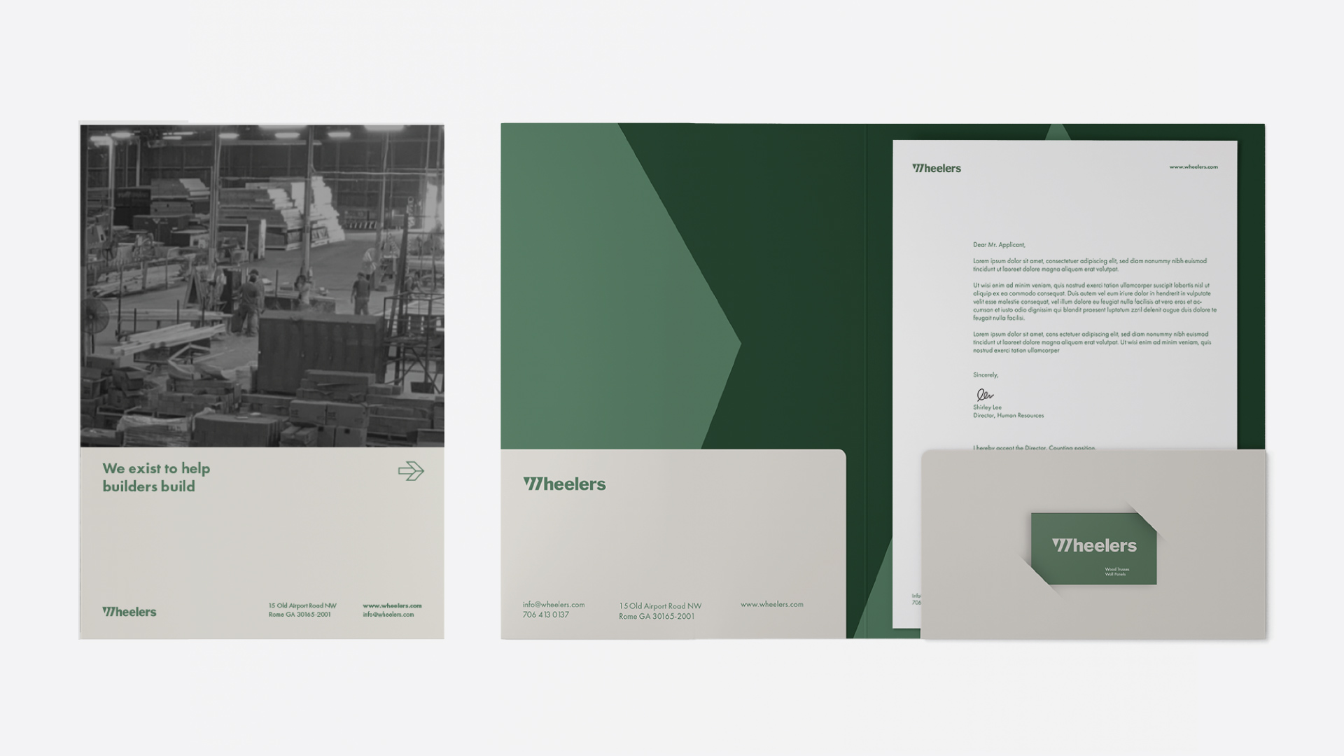
The sales deck includes a custom branded folder, business card, and Wheelers informational book for pitches.
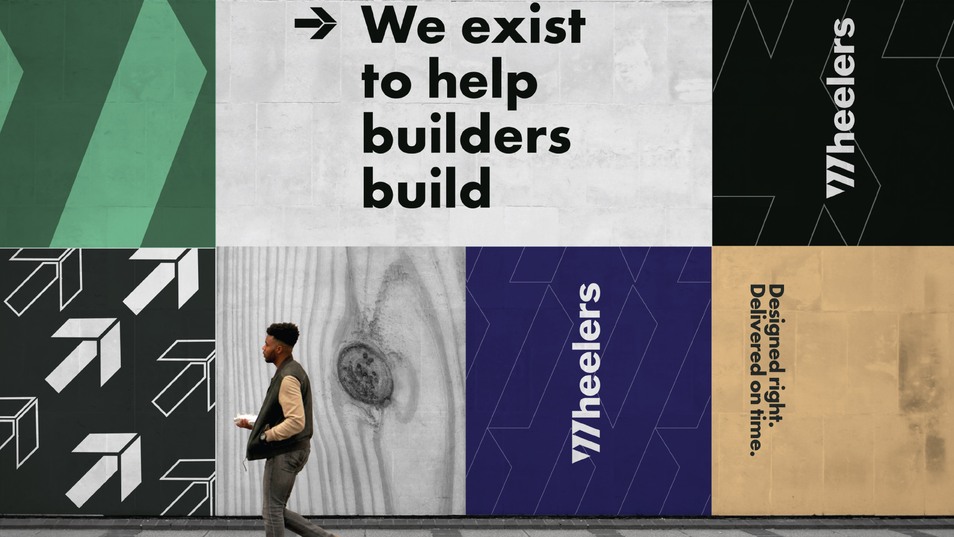
A man walks past a wall of a series of Wheelers images. It features the watermark, the wood grain, and arrows that mimic the peak of a truss. Text includes the phrases, “We exist to help builders build” and “Designed right. Delivered on time.”
The inside of Wheelers’ plant is on the front of a folder with the address, website, and email address. Inside the folder is light and dark green with a zoomed in watermark. Behind one folder flap is a letter. There’s also a slot for a business card as well.
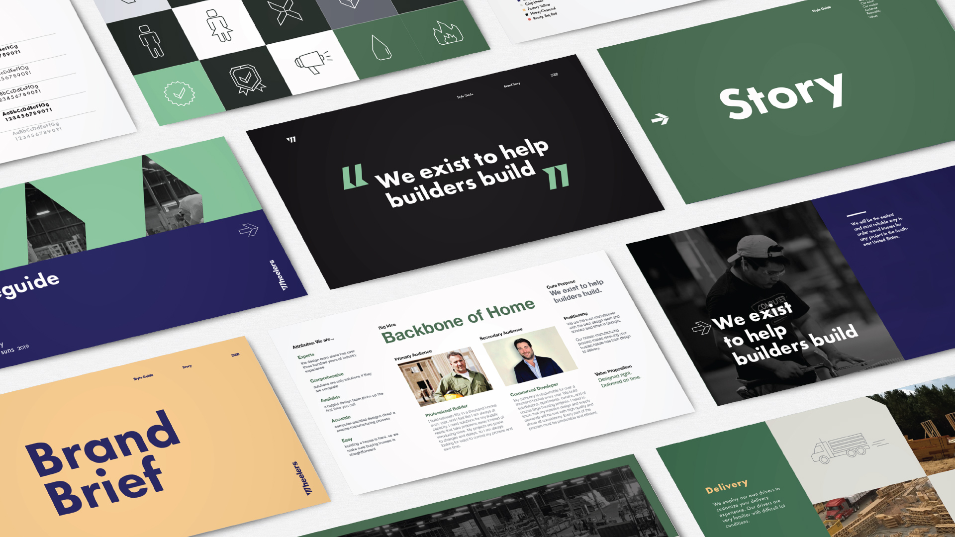
A series of images give a birds eye view of the brand brief. This includes the color palette, audiences, icons, story, and image guidelines.
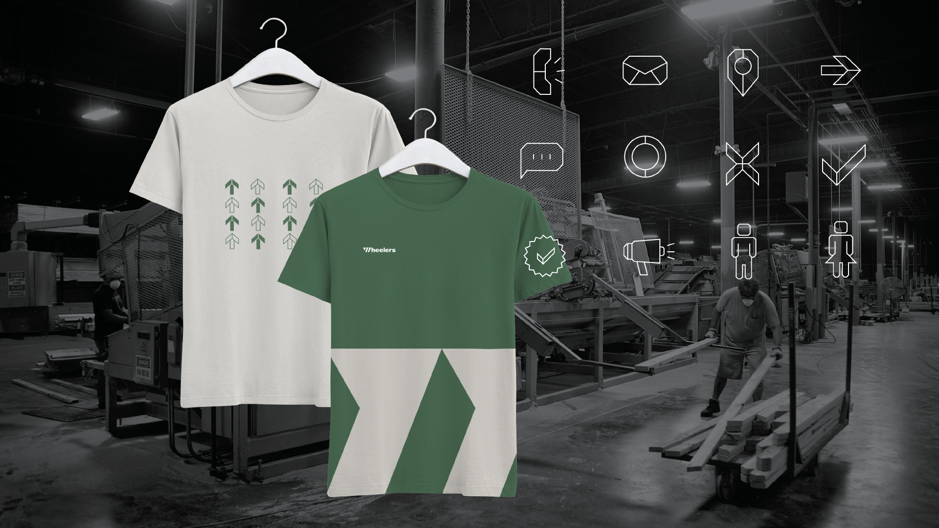
The Wheelers plant is in the background. In the foreground are two custom shirts. The cream shirt green arrows mimicking a truss peak. The green shirt has a cream colored Wheelers logo and zoomed in watermark. Next to the shirts are a series of geometric icons created for the site.
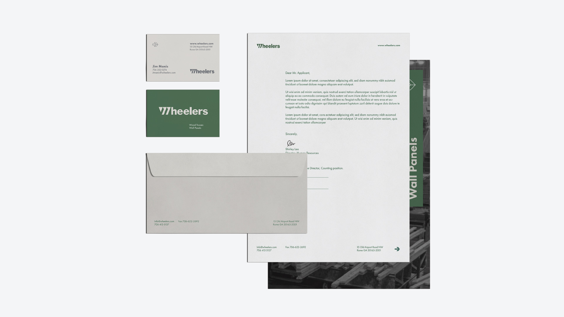
It’s important the sales team has the right tools. This includes a Wheelers letterhead, business cards, branded envelopes and a branded folder.

Creative

We updated the website with improved branding, condensed messaging, and easy-to-use calls to action that drive customer growth. We revamped their entire identity, including a new logo inspired by the teeth of the saw used to cut the trusses at the mill. We revised their brand throughout the mill and rebranded their fleet of trucks. A digital ad campaign was developed with research and strategy and continuously revised based on the metrics they were receiving. Custom-branded sales tools are a big help when heading out into the field, so we equipped their reps with new materials.

Wheelers is an ongoing full-service account, and we continue to develop creative to help increase awareness and shift the creative strategy with the ever-changing market. This client has direct access to us at any time, and we fulfill any and all creative needs that may arise.
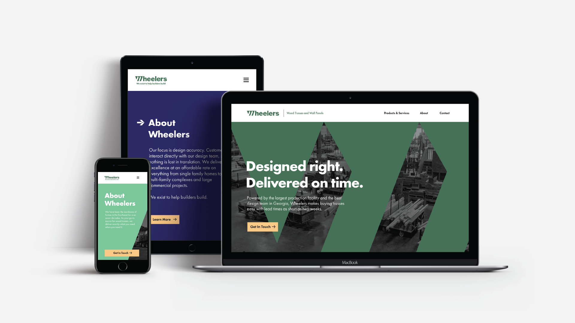
A smartphone, tablet, and laptop sit next to each other to illustrate how the new website looks on different devices.
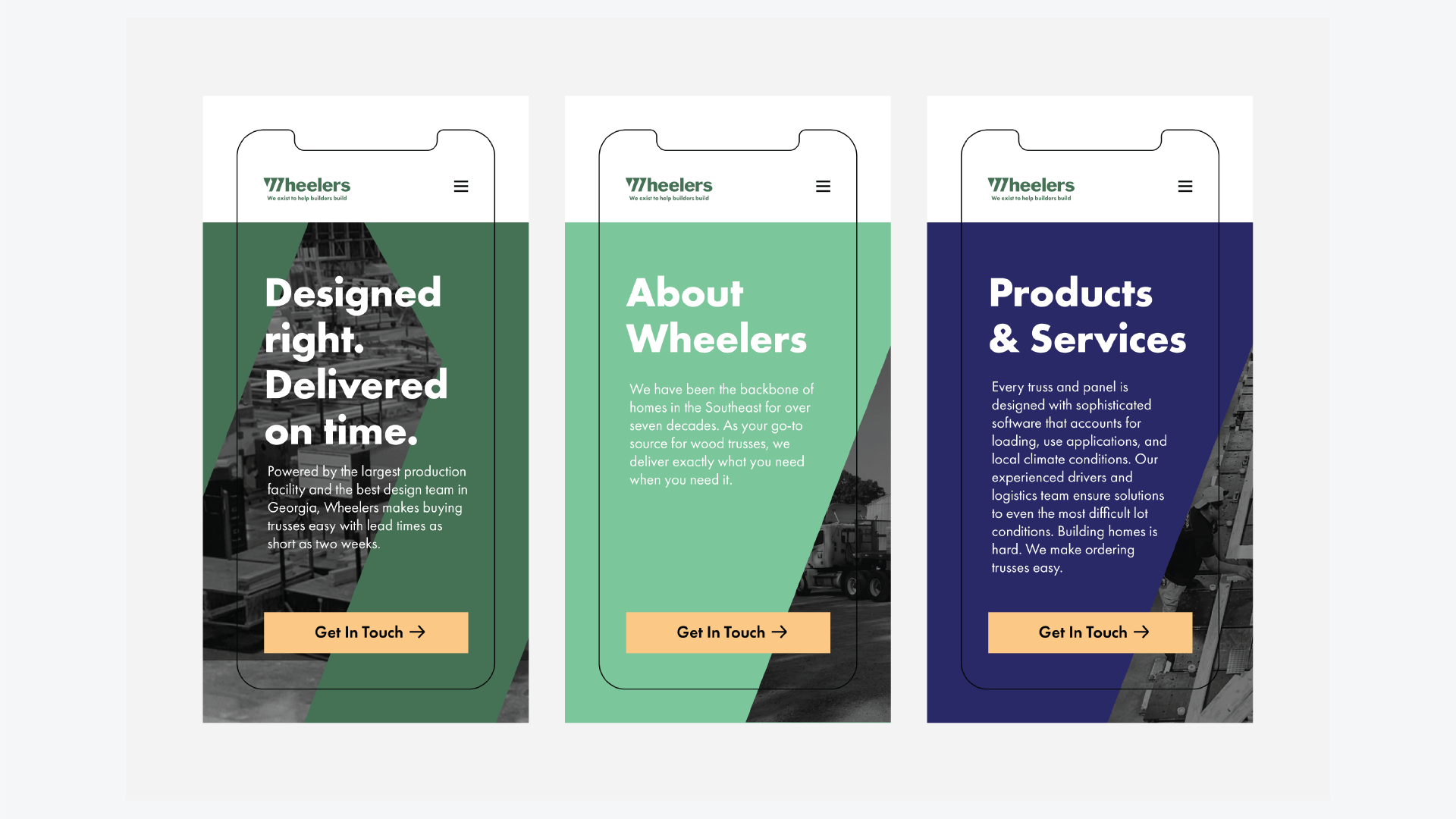
Each page on the website has a similar design but utilizes different colors. The home page is the signature dark green. The about page is a lighter green. The products page is navy blue. All pages feature images of the Wheelers plant in the background.
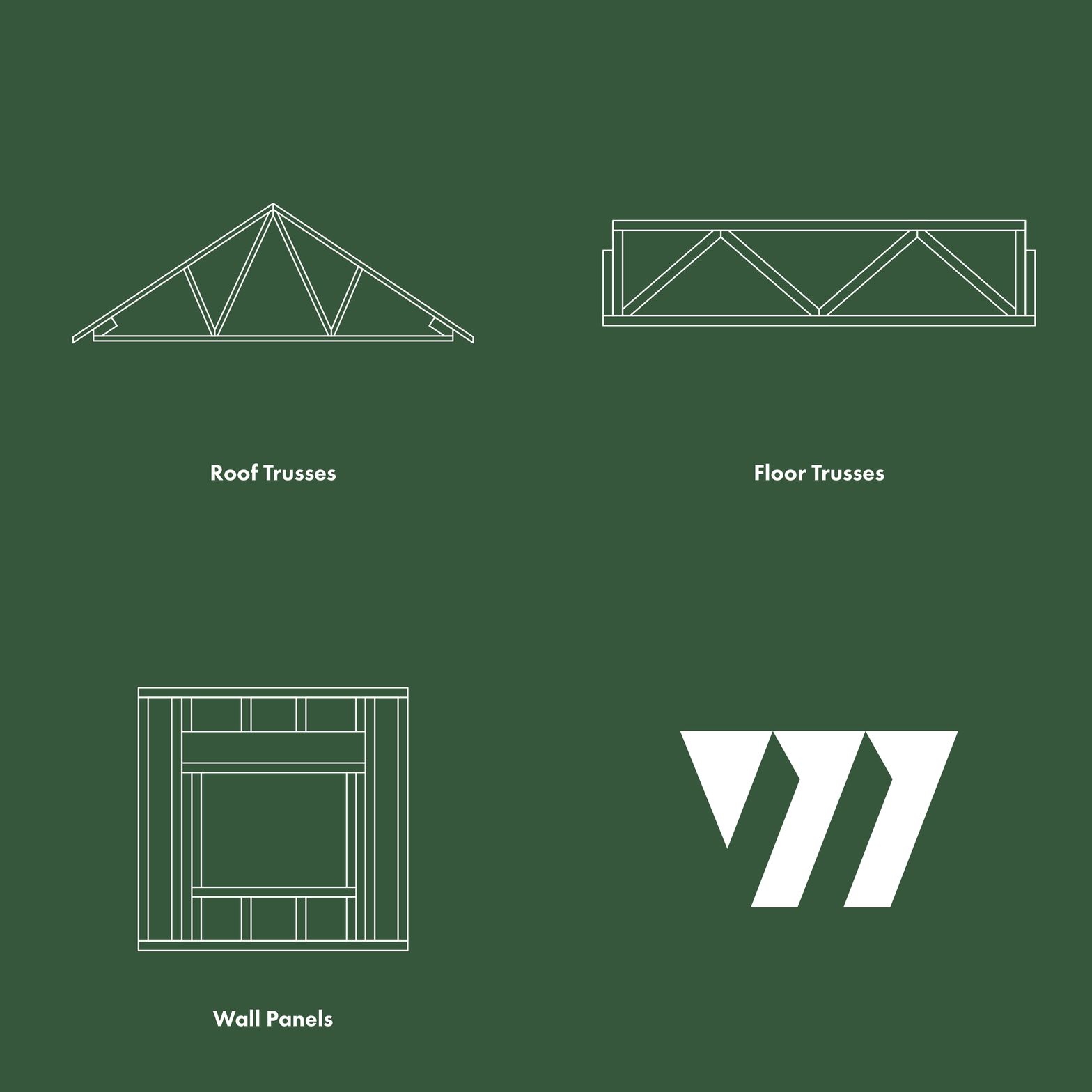
An illustrated fink wood truss is on a dark green background.

Results

We developed the easiest and most reliable way for people to order wood trusses for any project in all of the Southeastern United States. Wheelers saw tremendous success in the first 3 months, reporting:

  • 147 New Leads Generated
  • +478% ROI
  • $25K in Sales
  • Over 10,000 impressions
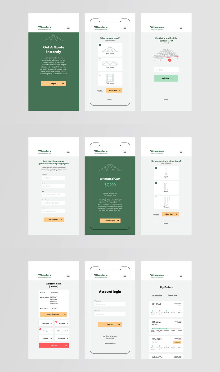
A concept of a calculator where customers can get an instant quote on roof trusses, floor trusses, or wall panels.
DEFINE YOUR BRAND.

Ready to take that next step?
We’d love to hear from you.