Deprecated: Function get_page_by_title is deprecated since version 6.2.0! Use WP_Query instead. in /var/www/headword.devphase.io/public_html/wp-includes/functions.php on line 5413

Artly Coffee

Introducing a robot barista to the world.
Full Service
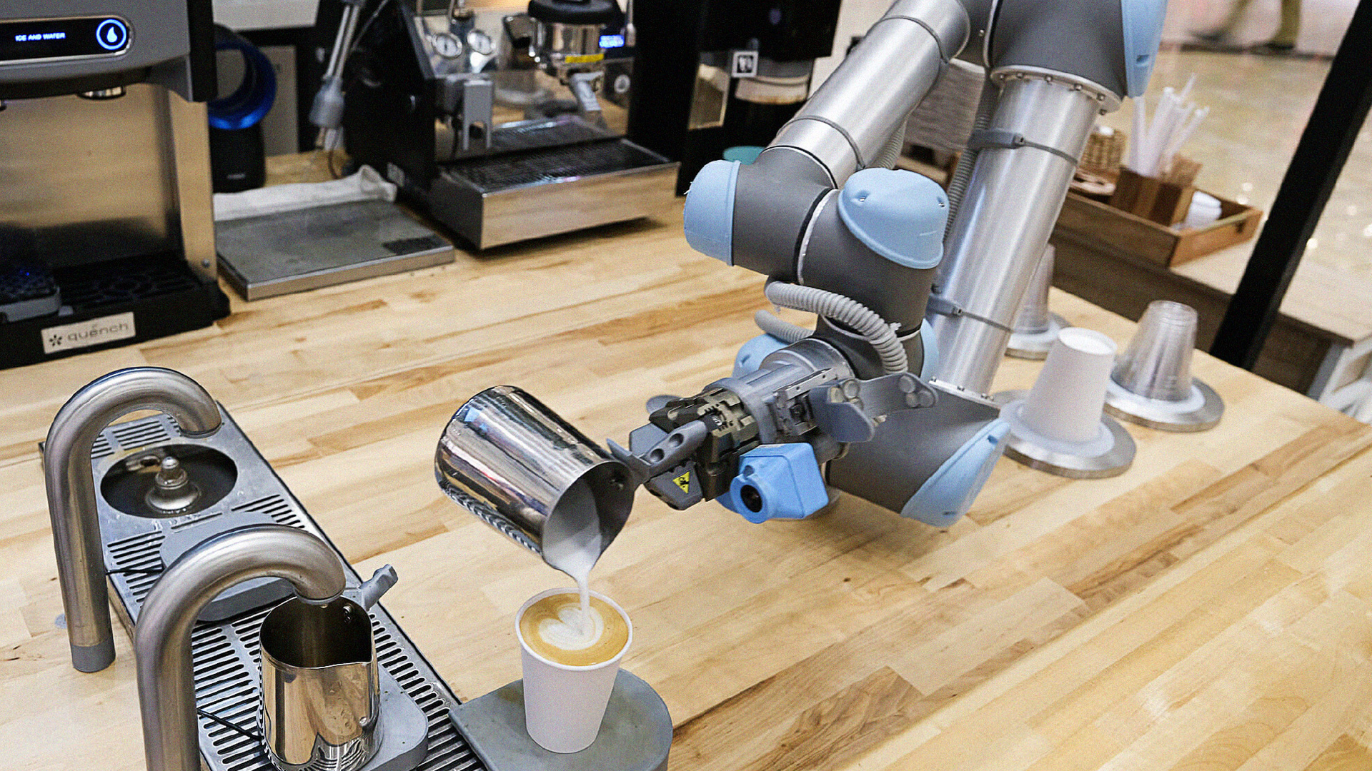
A robot arm pours freshly steamed milk into a cup creating latte art

Background

Artly is a barista bot built by a team of coffee-loving former Amazon employees. Much like a video game, it uses deep learning technology to mimic real baristas’ exact movements in order to make a variety of coffee drinks. The idea was to democratize high-quality coffee. However, how does a company convince consumers that AI-powered robotics makes anything of high quality? They came to Headword for the full-service package.

Services Provided

  • Brand Activations
  • Brand Identity
  • Campaigns
  • Content Creation
  • Digital Design
  • Experiential
  • Naming
  • Packaging
  • Research & Strategy
  • Retail
  • Video & Animation
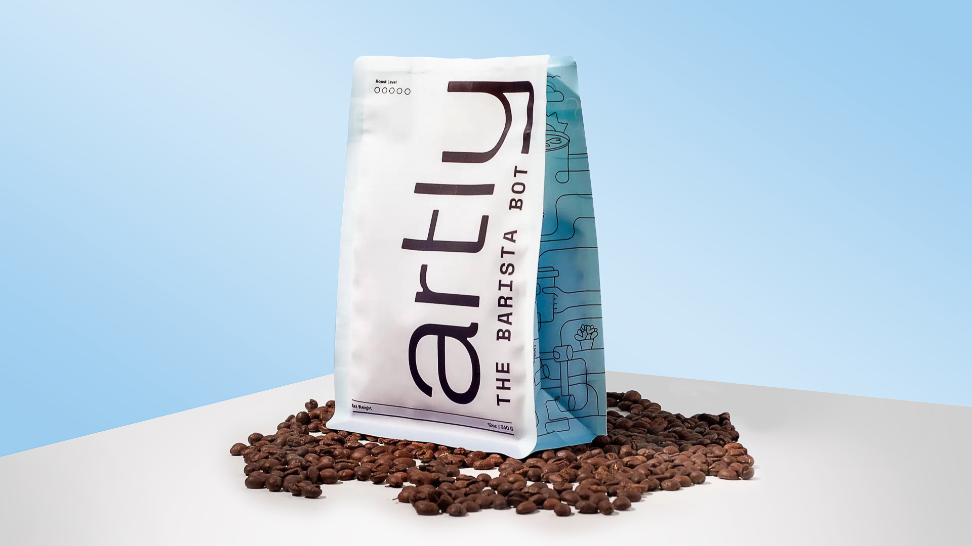
An white coffee bag sits on top of coffee beans on a white table with a blue background. The Artly logo is on the front with the side of the bag showcasing line drawings over a blue background.
The Artly logo is all lowercase black text. The words “The Barista Bot” in all capital letters line up with the tail of the “y” in “artly.”

Approach

Artly was a brand created from scratch. We had to develop a unique identity before moving forward with anything else. We did a full brand immersion and came up with Artly’s brand character and position, which guided our work for their look and feel.

We had the challenge of making AI approachable and fun, while simultaneously transforming the perception that a robot barista is a vending machine or some form of job replacement.

This was not only an all-new brand, but an all-new form of coffee-making. The market is saturated with coffee shops, but on-demand gourmet coffee made by a robot hadn’t really been seen done well before. Thus, Artly introduced a new industry strategy: placing high-quality coffee wherever coffee is not.
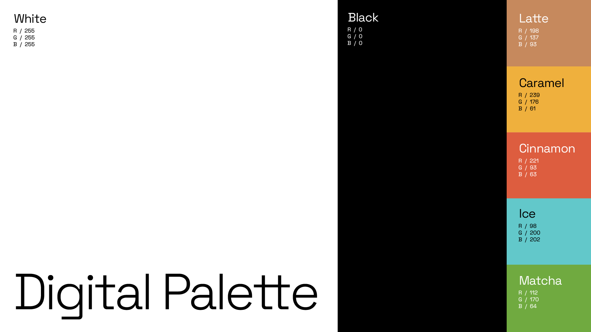
The Artly digital color palette is primarily black and white. The accented colors are latte, caramel, cinnamon, ice, and matcha.
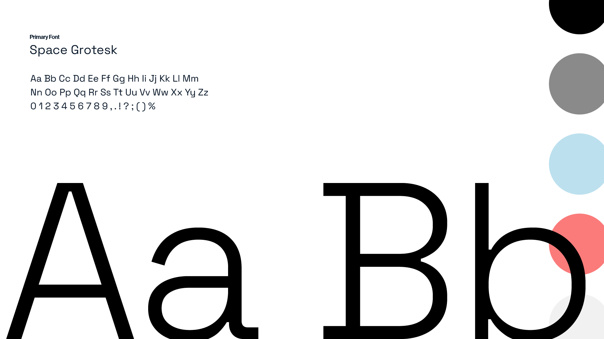
Artly’s primary text is titled “Space Grotesk.” The font is medium weight with clean lines.
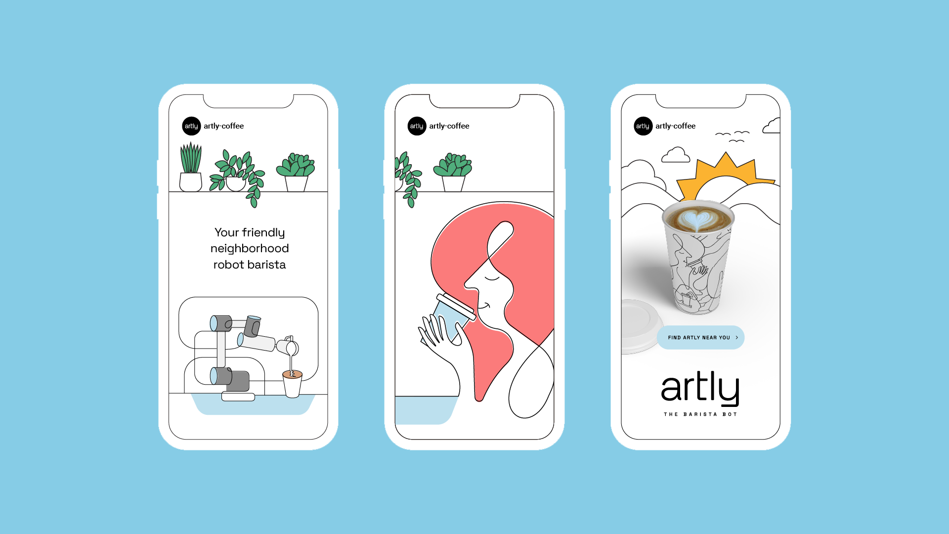
A mockup of three illustrated social media posts sit against a blue background. The first mockup features the phrase “Your friendly neighborhood robot barista” surrounded by plants and the robot arm. The second features a woman happily sipping coffee. The third features a coffee cup with the sun rising behind it.

Creative

We designed everything including their logos, cups, website, and even their storefronts. We crafted it with a sense of “human meets tech.” Inspired by deep learning technology and what Artly sees while going through its programs, we used hand-drawn illustrations of people and machines all linked by a single line. This made Artly more friendly and familiar. This throughline can be seen across their packaging and web presence.
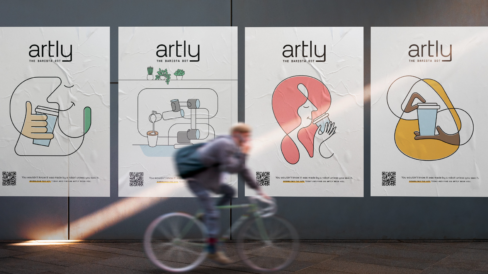
A bicyclist rides quickly by four of Artly’s illustrated posters.
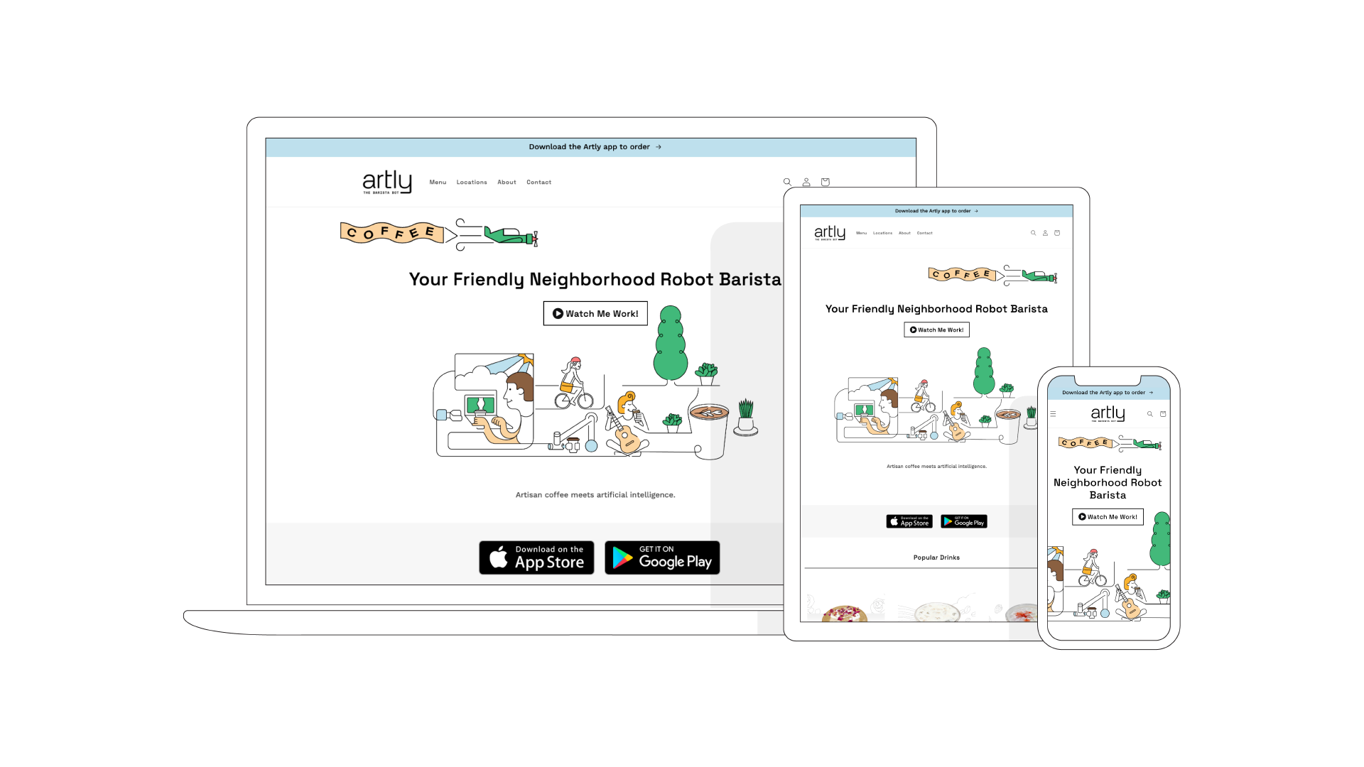
We mocked up what the website would look like on a desktop, tablet, and smartphone. Artly’s signature illustrations are featured on each page front and center.
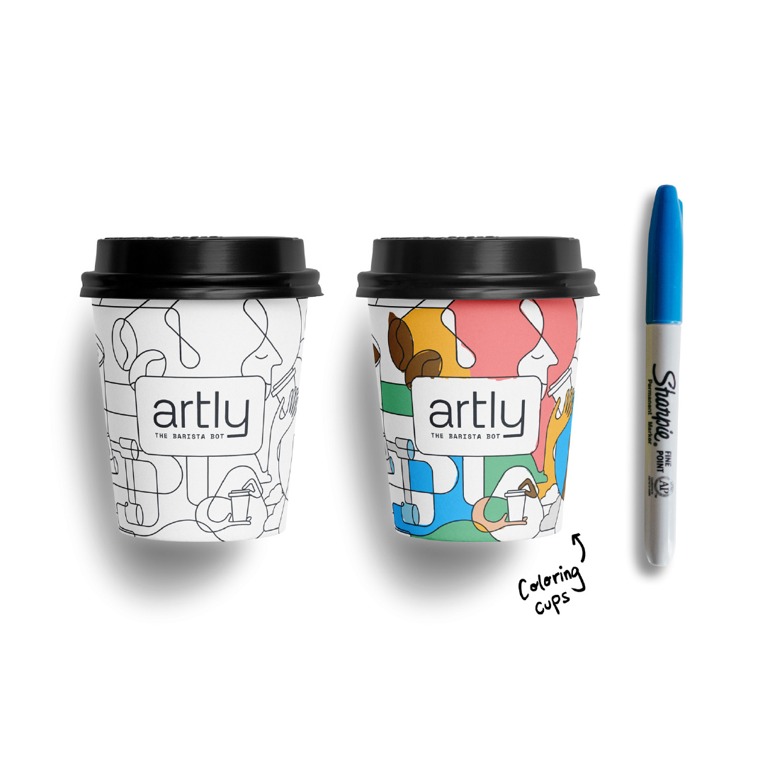
Two coffee cups with line drawings are side-by-side with a blue Sharpie. The cup to the left has the black and white line illustration. The cup to the right has the same illustration, but it’s partially colored in.

We designed Artly’s cups to be colored in by customers, another example of human interaction with tech. Coloring in the illustration gives the sense of a human’s touch. This look and feel extends across the brand and is used physically and digitally.
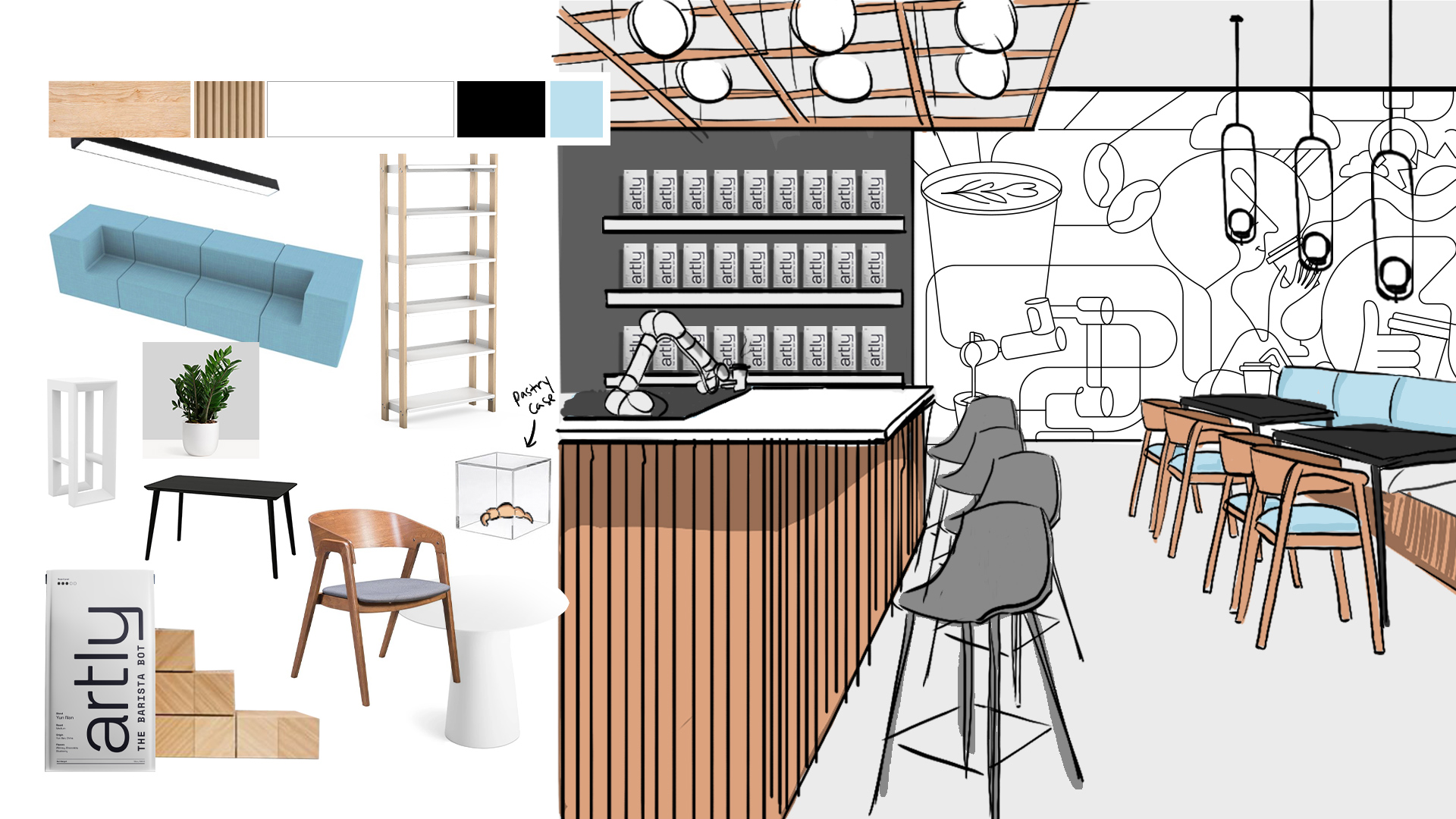
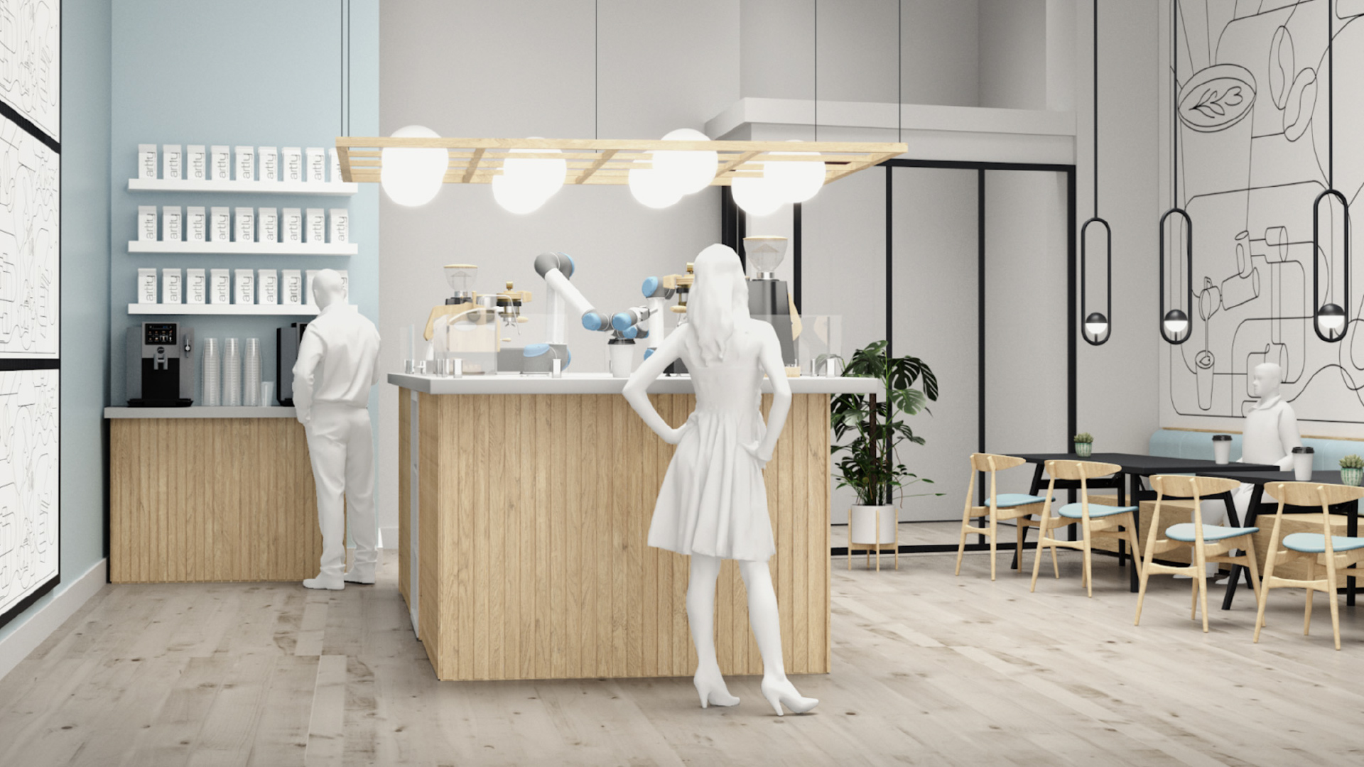
An illustration visualizes what an Artly retail space would look like compete with wood paneling on the bar, bar stools, and a powder blue couch with Artly illustrations adorning the walls.
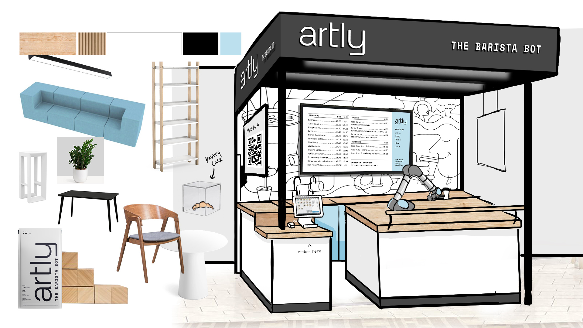
A freestanding Artly space would feature illustrations behind the counter, a screen from which people can order, and the robot arm making drinks.
Another mockup of the retail space is more photographic with computer-generated patrons at the counter and in the seats along the wall.
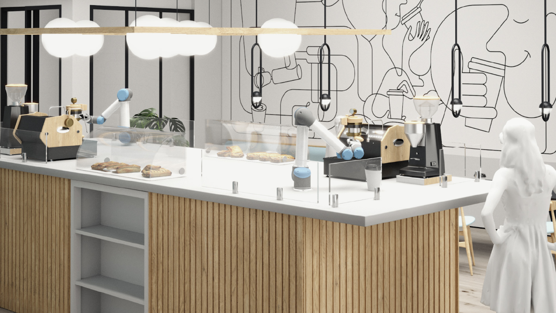
A computer-generated mockup shows what the retail space would look like behind the counter with spots for pastries and shelves for extra supplies.
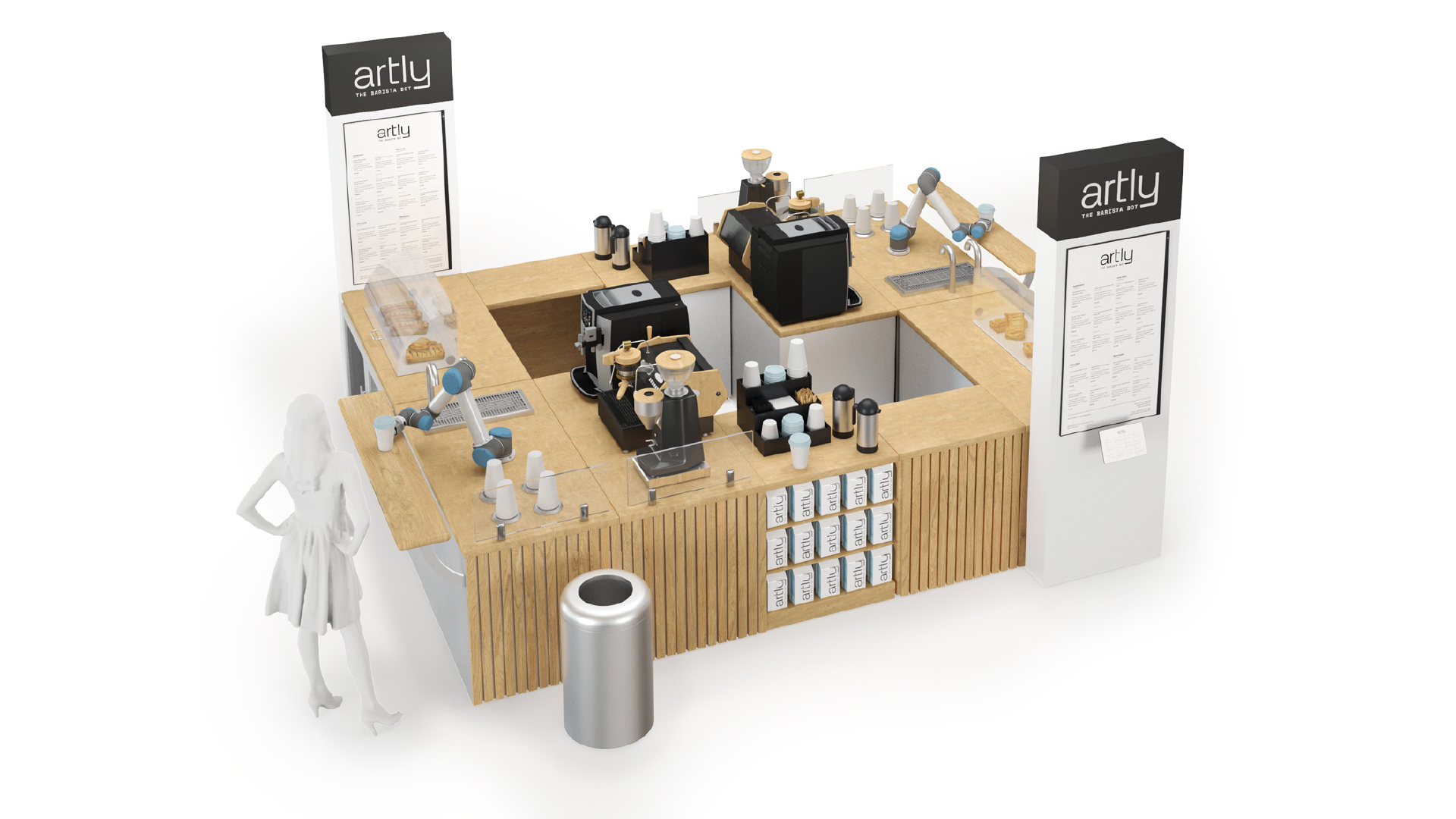
An overhead view of a freestanding Artly location shows two robot arms on either side pouring drinks and a patron waiting for her drink.
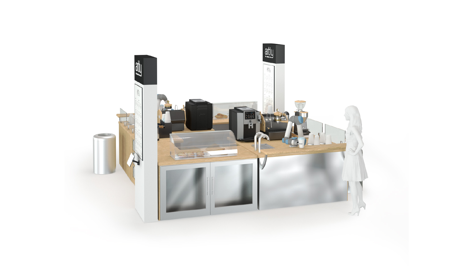
A second visualization of a freestanding Artly location shows a metal base with wood counter tops and “Artly” signs that tower on two corners. The look is clean and slick.
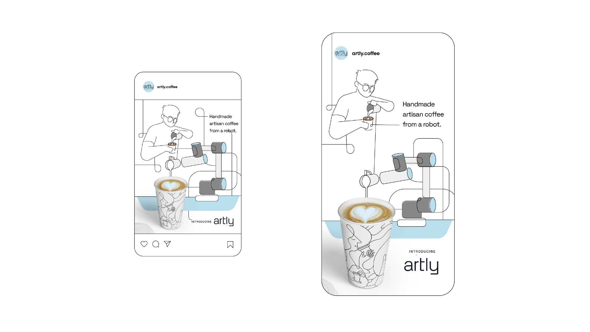
A social media ad we created for Artly shows a line drawing of a man pouring a latte, and that same line connects to a robot arm pouring a latte. The text says, “Handmade artisan coffee from a robot.”
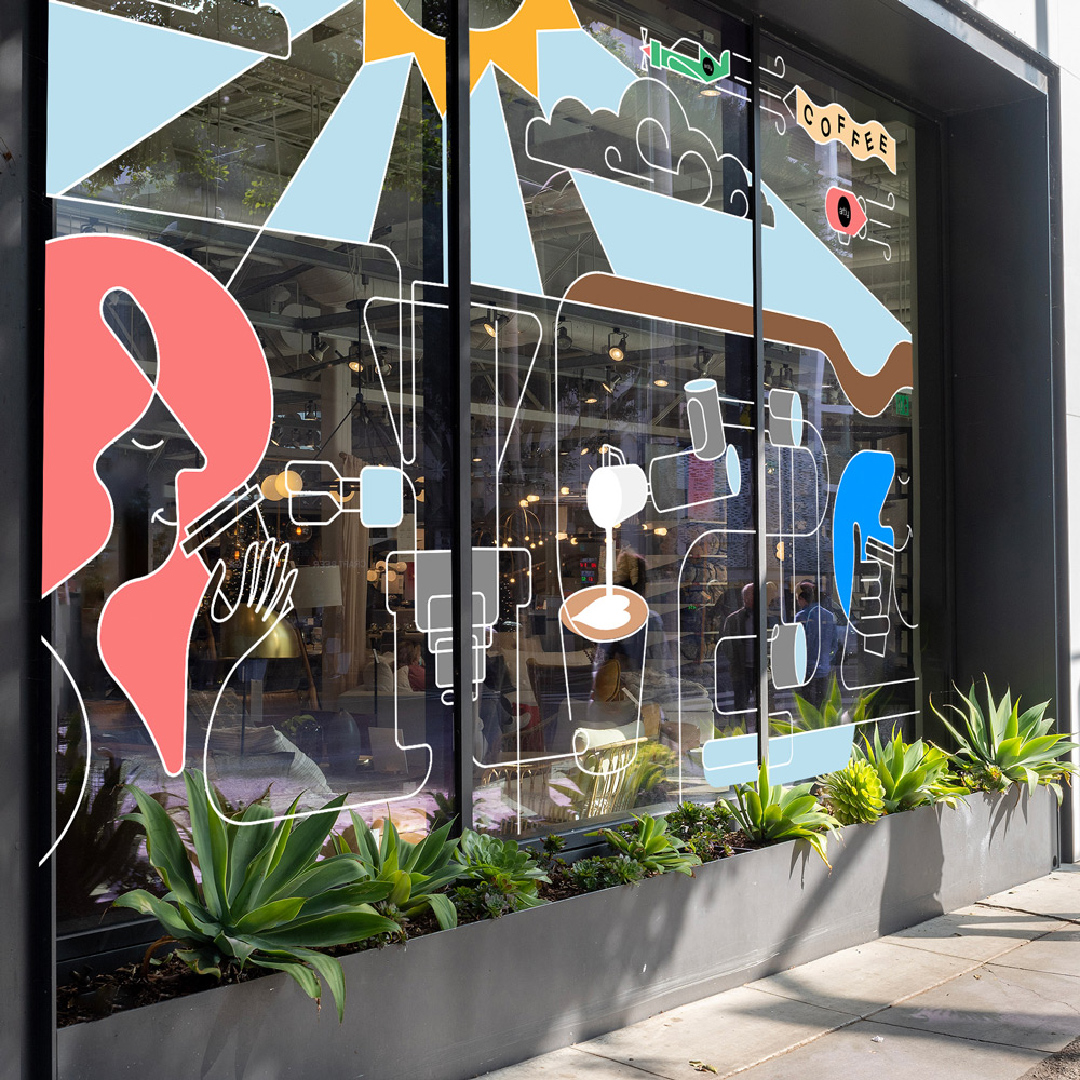
An Artly retail space includes their signature line illustrations along the windows of the storefront. It has pops of color, and green plants line the bottom of the window.
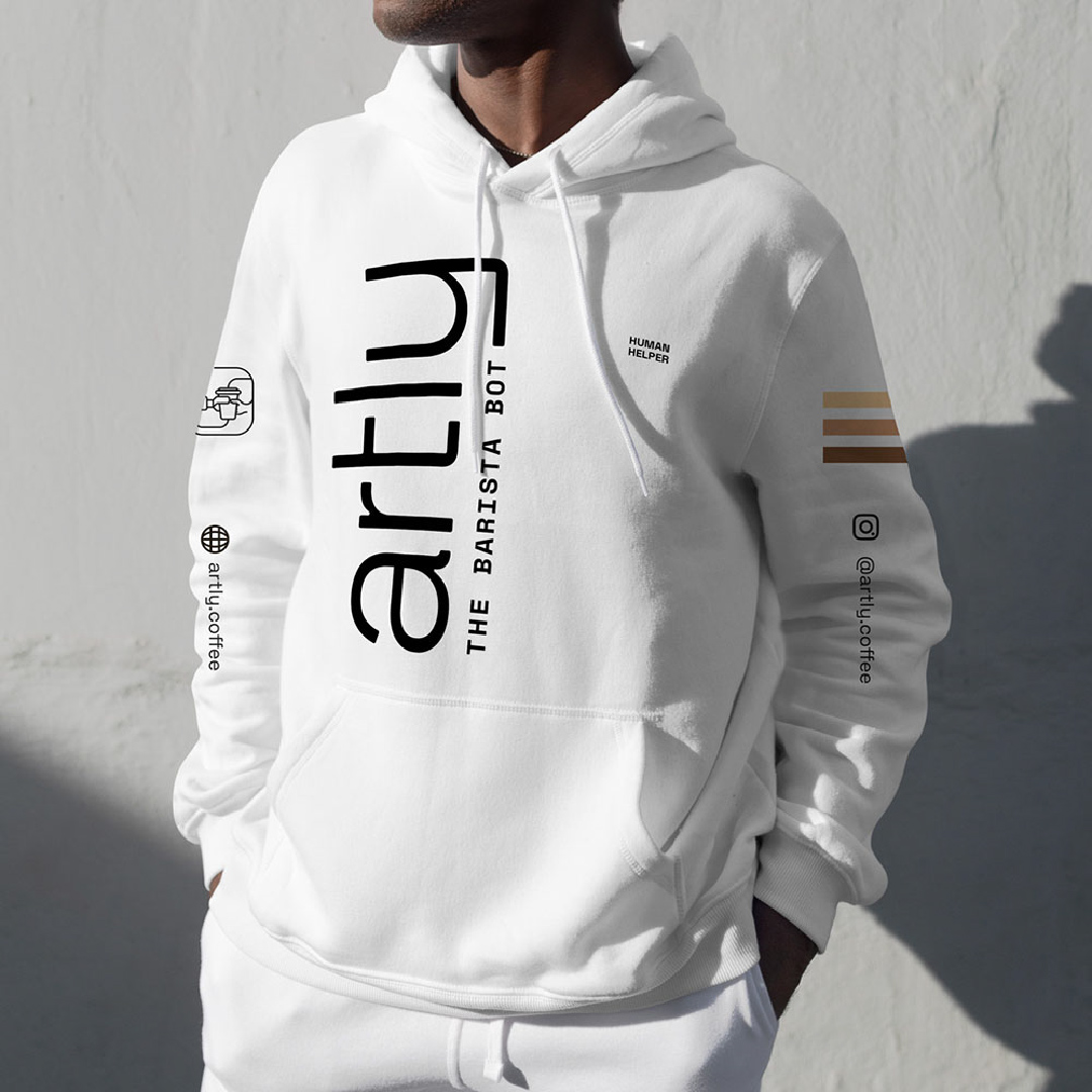
Hoodies for Artly staff are all white with the logo vertical along the right. The words “human helper” are on the left chest. The sleeves feature the website, Instagram handle, illustrations, and three lines of color.
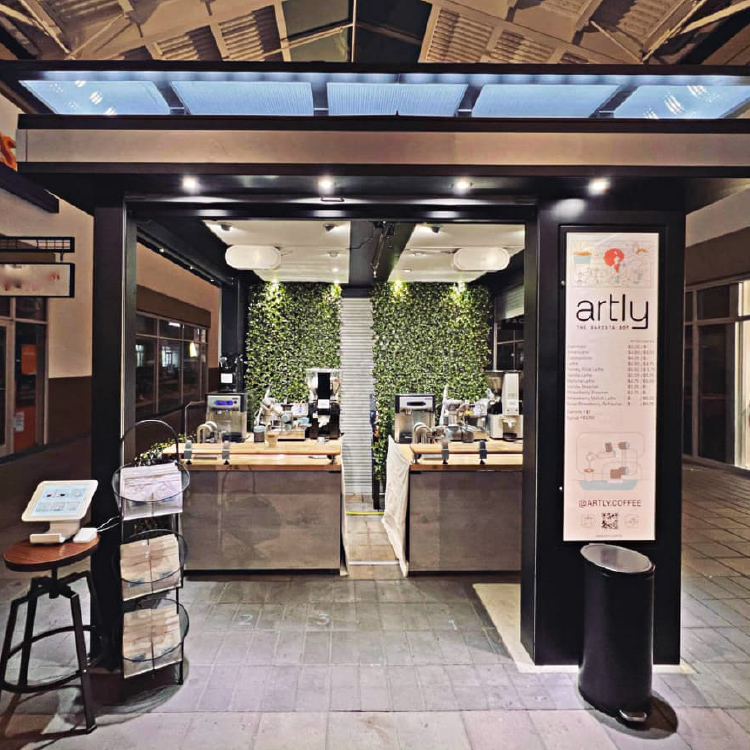
A freestanding Artly location has come to life. Greenery lines the back wall. The black paneling, wood counters, and bright lighting make it an inviting place for people to get coffee.

Results

Since our launch of the Artly brand, Artly has grown from zero locations to seven with so many customers that simply one robot is not enough for some locations. They are ever-expanding, and we are so happy to have helped bring a new wave of coffee into the world with Artly.
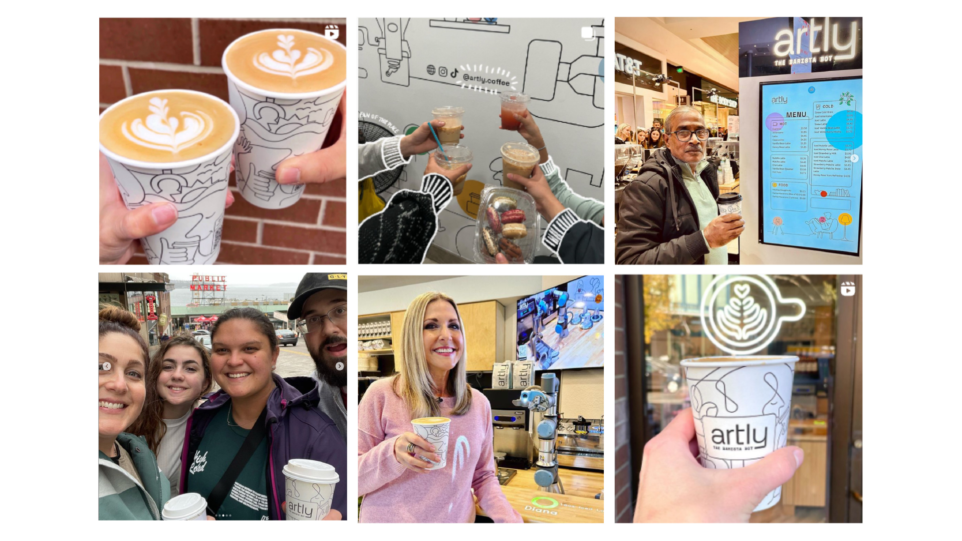
A series of six photos shows customers with their Artly drinks. Whether they’re cheers-ing or posing with the robot arm, everyone seems to be having a great time.
DEFINE YOUR BRAND.

Ready to take that next step?
We’d love to hear from you.