Super Joy: Branding Unique Coffee in Portland
Third-wave coffee. Yeah, we hadn’t heard of it either. So, naturally, we were intrigued and excited when Super Joy Coffee out of Portland, Oregon requested some of that good ol’ Headword branding.
Joe Yang is Super Joy’s owner and operator. He’s a Q-grade roaster and barista, and he wants to share his love of coffee with the world. Being from China, Joe didn’t experience coffee as the US does. In China, tea still reigns supreme for caffeine fixes, and coffee shops just aren’t that common. So Joe took his special brew to the most coffee-crazed place he could find…Portland. It was here he started the town’s first Chinese coffee shop to share his magic with the world.

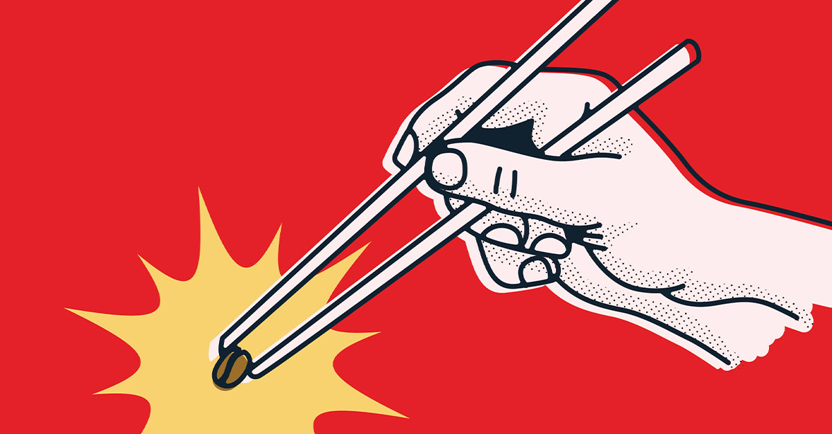
What makes Super Joy’s coffee so special is Joe’s unique beans and attention to detail. First, he sources his beans from unconventional regions such as China and Myanmar; places you don’t expect good beans to come from. He then quality inspects each bean with chopsticks, sifting through which beans make it into his roasts, and which don’t. With the beans that pass his inspection, he roasts them using highly refined and scientific techniques that Joe has come to master. You can taste his passion for coffee in every sip.
Joe came to us with a very bare-bones brand. Well, two brands actually. He had In-Joy Coffee, his coffee shop, and Super Joy Coffee Labs, where he roasted his beans. We decided to put both entities under one name: Super Joy Coffee. We felt that his current brand, from packaging to posters, wasn’t really showing who Joe was, and it wasn’t setting itself apart from the rest of the massive coffee scene in Portland.

We decided to capitalize on the unique flavor that Joe’s beans bring to coffee as well as his Chinese heritage, positioning him as the premier Chinese coffee shop in Portland.
China has a very rich history, distinct culture and unique things to draw inspiration from. We looked at Chinese calligraphy, chopsticks, even symbols and icons that identify as uniquely Chinese such as the yin-yang symbol, and patterns created from Chinese knots. We wanted to take the most identifiable symbols that we could find to be able to influence the brand.

Likewise, Portland also offers a very unique culture to draw inspiration from. “Keep Portland Weird,” sticker bombing every street sign, the gritty underbelly of Portland punks; we wanted to take the best of Portland’s icons and find a way to connect it to our Chinese influence, creating one unique design language.
Color is important to help connect the brand to Chinese culture. Reds and blue are easy ways to identify Chinese brands and we wanted to maintain that. Similarly, Chinese characters and calligraphy were infused into English letters. We used icons that have meaning but also contain subtle coffee cues, like coffee cups or coffee plant leaves.
We also used a comic-book art style of illustration to help bring our key visuals to life, incorporating subtle halftones to mimic the art of comics and screenprinting. Fun fact: screen printing actually originated in China as a way to transfer designs onto fabrics.

Through several rounds of creative, and meetings with Joe, we created something that both of us were truly happy with. By the end of the branding process, we landed on what turned out to be award-winning branding and packaging. So if you find yourself in Portland, stop by Super Joy, and grab yourself a cup of Joy. Oh, and tell Joe we said hi! And also get a soy sauce latte. And check out the robot arm he uses. Ok, we’ll stop.
